Branding Two Good
How the name and the mark actually came together: the false start, the shortlist, and the first board.
Naming this turned into its own little project, separate from the station build itself. It started nowhere near "Two Good" and took a few real pivots to get there, worked out back and forth with an AI collaborator rather than landing in one sitting.
None of it is finished. What's below is the actual path so far: the direction that got dropped, the shortlist, why "Two Good" won, and the first pass at turning it into a visual identity.
-
The actual starting point: The Daily Pour
The very first name tried was The Daily Pour. It didn't last long: it read like a description, not a name, procedural and mechanical, generic enough to belong to any coffee shop anywhere, with no real emotion in it. That's what pushed the search toward something with more personality next.
-
Next: Day Folk
The next direction was a name called Day Folk, paired with a logo built around a custom wordmark rather than a coffee symbol pasted above a generic font. Even at that stage, the instinct was to make one or two letters do the work of an icon, so the brand would be recognizable from the type alone.
-
Widening the search
Once coffee and matcha settled in as the two drinks the station is actually about, the naming search widened around that pairing. A long list came out of it, most of it structured around the number two:
- Two Cups
- Two Mugs
- Two Sips
- Two Pour
- Two Pours
- Two & Co.
- Two Things
- Two Good
- Two Good Cups
- A Pair
- The Pair
- Pair
- Twofold
- Double Cup
- Cup for Two
- For Two
-
"Two Cups" first
"Two Cups" was the early favorite. It ties directly to two people and company, gives coffee and matcha equal billing as "two drinks, two worlds," feels intimate rather than commercial, and hands over an obvious logo direction: two simple forms, not literal cups. It also just sounds right said out loud: "let's go to Two Cups."
-
Landing on "Two Good"
"Two Good" ended up stronger. Same personal, slightly cheeky tone, but with more to build on: a built-in pun ("two good" sounds like "too good"), and a name that extends naturally across everything on the menu: Two Good Coffee, Two Good Matcha, Two Good Cups, Two Good People. Two Cups is charming. Two Good reads like an actual brand.
THE MARK
For the mark, the decision was to stay away from drawing a cup or a whisk. Instead the two O's in GOOD became the device: a custom typographic identity where the letters carry the whole logo, so it still reads as Two Good on a mug, a jar, or a tin with no icon needed at all.
A quick look at what got tried before landing on the two O's: the literal icon directions, sketched out and ruled out, next to the one that stuck.
-
A literal cup
-
A literal whisk
-
A coffee bean icon
-
Two interlocking O's — kept
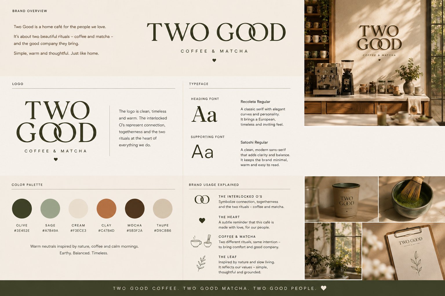
- Interlocked O's: connection, togetherness, the two rituals
- Heart: made with love, for our people
- Leaf: nature and slow living
Simple · Warm · Thoughtful · Earthy
Everything here is AI-generated concept work. Nothing physical exists yet, no prototypes, no printed anything. Real photos should start showing up here in a couple of months, and this page will get updated once they do.
The leaf and the heart earn their place here: nature and slow living, made with love. Recoleta and Satoshi carry the typography, and the two O's are the core device.
This page is ever evolving, same as the rest of the café. Back to the full story.